HORIZON : CAFE & RESTAURANT
ALSO DESIGN STUDIO TURNS THE OLD HOUSE INTO A CAFE BY INCORPORATING THE SITE’S EXISTING ELEMENTS SUCH AS OLD TREES, PARKING GARAGES, OR EVEN THE OLD HOUSE ITSELF TO DELIVER A COMFORTABLE AND RELAXING VIBE BY THE KOK RIVER FOR VISITORS
TEXT: MONTHON PAOAROON PHOTO: PATIWETH YUENTHAM EXCEPT AS NOTED
(For Thai, press here)
Horizon: Cafe & Restaurant is in a fairly remote area east of the Kok River, outside of the province of Chiang Rai. Ratchapol Buajoy, a Chiang Rai native and founder of Chiang Mai-based ALSO design studio, is the architect in charge of the renovation of this old building turned cafe. The project began with no brief, just a straightforward requirement from the owner to open a cafe, and the architect was given complete creative freedom. Ratchapol stated that having such autonomy made the project both easy and difficult. But he went on to work out and incorporate the site’s existing distinct elements and strengths, using them as key ingredients in the design. Such elements include the trees growing inside and around the garage and the old house with a deck that opens to an unobstructed view of the Kok River.


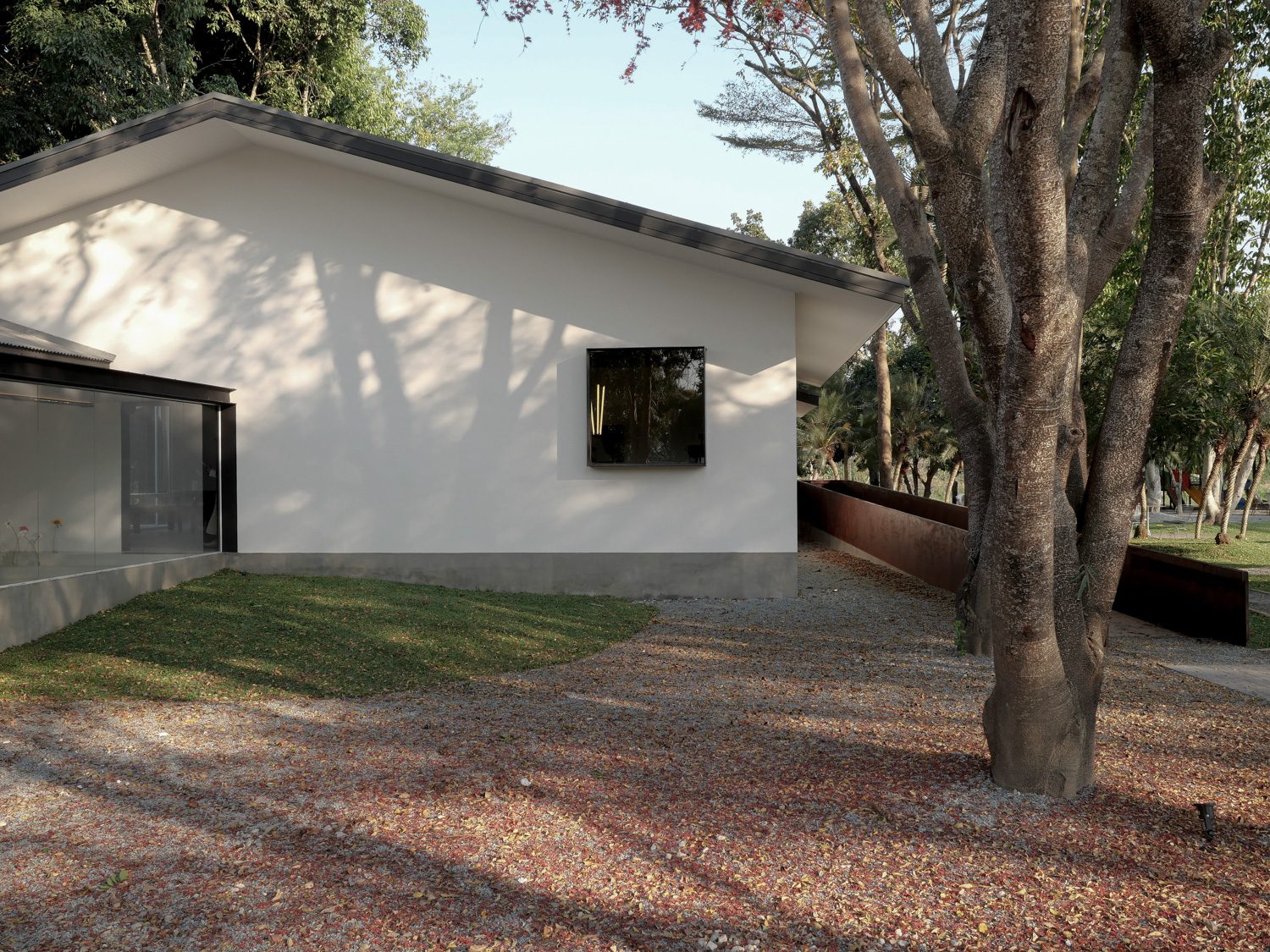
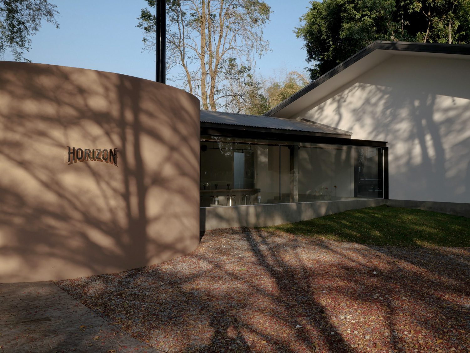
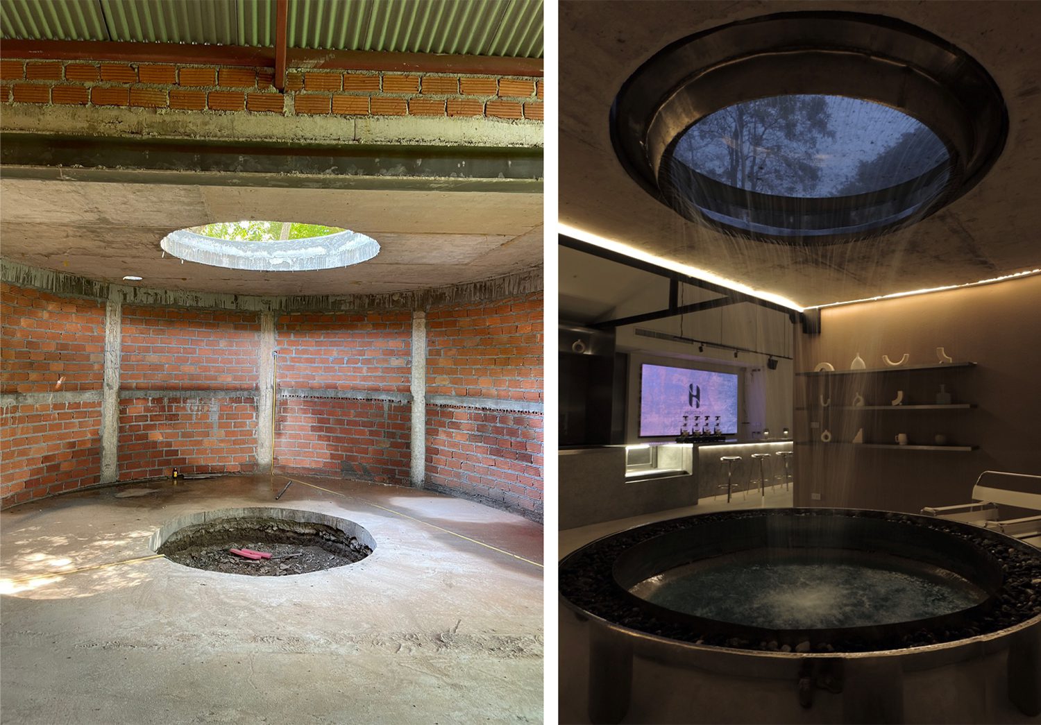
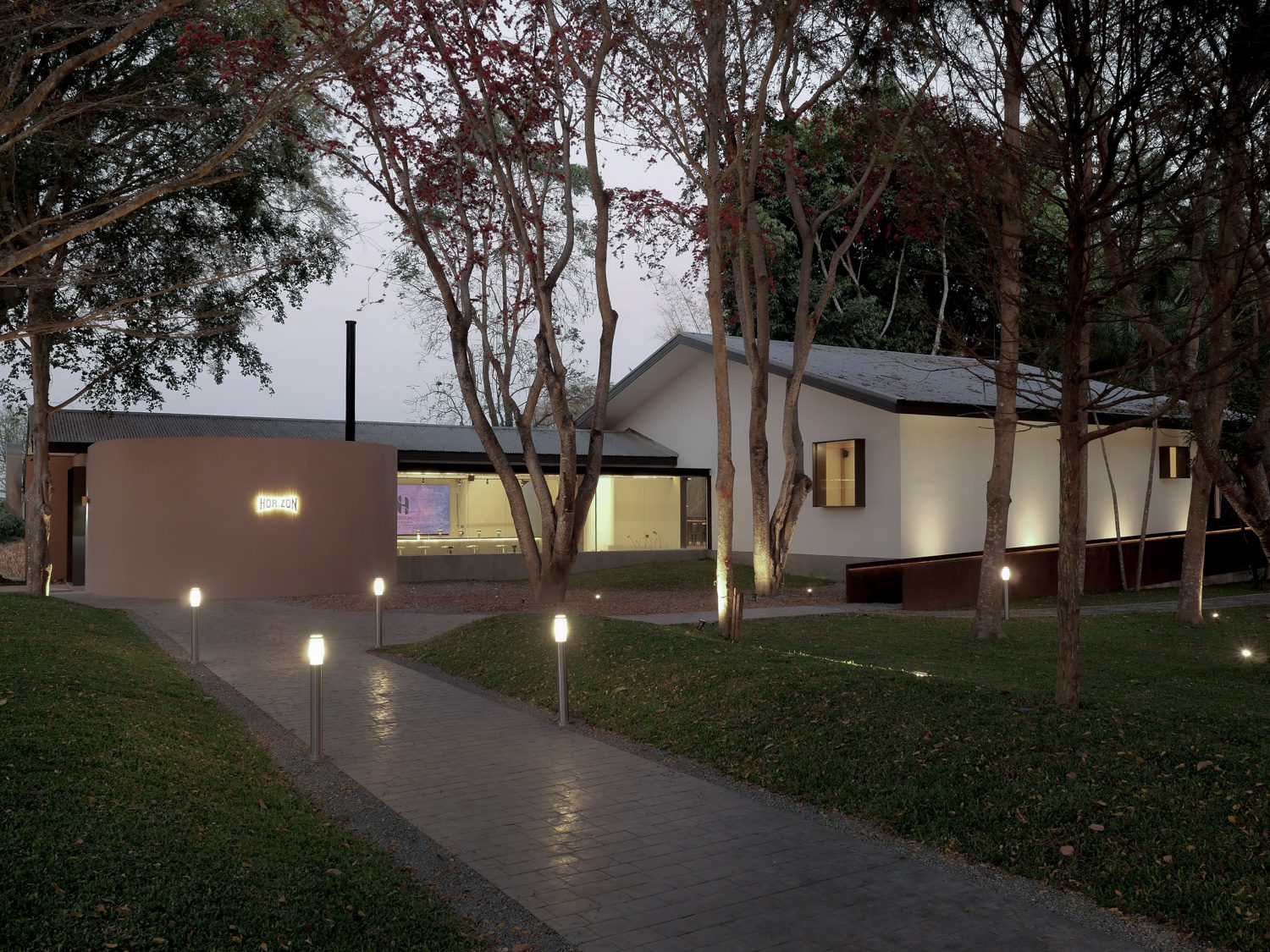
The renovation began with a redesign of the parking area in an attempt to connect the original garage building and the house into a single structure, with the service area added in the back. The garage building was converted into the cafe’s entrance and the main counter, where all the coffee-making takes place. The first thing one notices upon entering is the waiting and order pick-up area, which has arched features intended to bring sculptural elements to the space. The final look differs from the architect’s initial vision for the space, which would have included a skylight and an infinite water well to give the space a sense of serenity. The primary design went through a series of trials and errors with the contractor because the architect personally witnessed the aesthetic effects and angles of light that would interact with the space if the idea were to materialize. The slow-bar counter occupies the new extension, whose glass walls beautifully frame the view of the verdant trees and plants.


The space inside the old house is the next segment of the spatial program. The architect chose to remove the walls that divided the rooms in order to create an open-plan layout that was outlined by the original roof structure. A section of the interior space adjacent to the neighboring plot of land is built into an indoor courtyard that showcases the raw characteristics of the original columns and the newly grown trees. This courtyard is the architect’s effort to curate a different user experience using natural light effects that differ from the first part of the cafe’s spatial program. The original structure is preserved in this area, with additional structural elements added to the multi-leveled seating.
The renovation of the original deck at the back of the house that opens up to the Kok River includes new windows and doors, which contribute to a better spatial flow. The pool is also preserved but given a new finishing material. The architect also incorporated a ramp to make it easier for elderly people and disabled individuals to access the area than through the building. The ramp creates a line that visually softens the solid-looking mass of this side of the building. Meanwhile, the ramp rails are made of steel coated in a rusty color with a gradient tone that matches the color of the exposed brick walls of the old building, which is showcased as part of the interior decoration. The design of the accessibility order begins at the entrance to the back section and then connects into a full circle at the entrance. The landscape architecture opts for maintaining the neatly growing tree lines while adjusting the mounds to create a better sequence and continuity for the space and spatial experience when one first enters the property.
What is particularly notable about the interior and architectural design of the building is how it takes into account the color tones of the original materials. The design starts with the colors of the exposed concrete columns and brick walls. Then, new colors and materials are added to complement the ones that are already there. The actual work process included numerous color and material tests, such as the creation of over 30 concrete block samples to find the one with the right tone, which ultimately keeps every element of the building beautifully cohesive.
Ratchapol explains how the ALSO design studio’s slogan, “You are happy, so am I,” reflects an approach to design that does not primarily put the architect’s idea at the center of each project but instead focuses more on the sharing of inputs from everyone involved to achieve the most gratifying outcome. Horizon exemplifies such a philosophy. Despite its distant location from Chiang Rai’s city center, Horizon is gaining popularity among a wide range of clients, from teenagers and the elderly who come to chill and hang out to families with children looking for a place where everyone can spend and enjoy their time together.

facebook.com/ALSOdesignstudio
Link nội dung: https://nhungbaivanhay.edu.vn/cafe-horizon-a66849.html